Showing posts with label chapman. Show all posts

Saturday, April 22, 2017

Gallery Picks Newsletter: Spring 2017

We've been busy here at the Gallery!  This is nothing new, but finally the decks have cleared a bit and we can announce a brand-new installment of our Gallery Picks Newsletter.  If you haven't joined us for one of these before, not to worry:  we'll explain as we go along.

In this edition we show off gorgeous new items from several of our incomparable artists, both established and new to the Gallery; we are excited to share their always-amazing work with you.  We will also touch on our latest forays into social media, and ways you can get to know us and our artists better.  With so many of us participating in social media these days, why not join in?  Interactions are easy, it's fun, and many of our artists are already actively involved and inspiring us to do more.  We'll delve a little deeper in a subsequent post.  So stay tuned, and keep these icons in mind:


Also featured:  An extended look at the ceramic art of Sarah Kaye, new to the Gallery this month.

Don't forget:  We've divided our featured artists' work to correspond with their shop sections.  You can access the shop sections to see all the contributing artists by clicking on the section titles.  Some artists work across mediums, but we will always alert you to it, as well as pointing out any accessories by other artists that might appear in photos.  For more details, to indulge in a little window shopping, or to purchase directly from the comfort of your home, simply click on individual photos to be transported to the Gallery's extensive online Shop.  There are actually lots of handy links sprinkled throughout the post to connect you ever deeper with the artists, their lives, and their art via our main web site and related posts on this blog.  (It's quite magical, isn't it!)

Without further ado, let's take a look at these lovely new items currently gracing the Gallery.


The Extraordinary Art of Carol Lee Shanks.  (Photo credit: Elizabeth Opalenik)
The stunning bunny mask heralds not only spring, but serves to
highlight the talents of textile artist extraordinaire Carol Lee Shanks.
For example, look at the gorgeous fabrics adorning the Bunny and
its model (we suspect beneath the mask we might find the
artist herself!  But our lips are sealed...)
(So sorry - Bunny is not for sale.)
Her enduring designs and canny fabric choices are always
bold, unexpected, exciting, yet align closely with elegant classicism,
making her clothing eminently wearable.

Here are several examples, with more to be found on Carol's
artist pages, here, along with her impressive biography.

Fine Line Jacket.  Carol Lee Shanks
Spring in the Northwest:  blue skies, crisp breezes, rhododendrons...
and the perfect jacket.
And just because we can, here's another look at it:
http://theislandgallery.net/shop/index.php?main_page=product_info&cPath=1_115&products_id=2276
 So beautiful, and what a lovely photo.  The colors and awakening
landscape remind us of something pastoral and peaceful, a
country escape, perhaps.
The necklace, Begona Rentero's mauve Holanda, is a cluster of paper
tulips perfectly aligning with the spring feel and theme of this post,
and can be found with Begona's other collection of necklaces,
right here.
http://theislandgallery.net/shop/index.php?main_page=product_info&cPath=1_115&products_id=2279

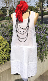
 Ready for spring, with summer promises... layer
now, slip on later with no more than a fun piece of
jewelry (this necklace is a NEO creation; see more of
this favorite jewelry line here).

http://theislandgallery.net/shop/index.php?main_page=product_info&cPath=1_115&products_id=2284

An elegant cape style top, over fun plaid capri pants. So obviously
Carol Lee Shanks, showing her distinctive styling from top to toe.  We love the
little touches... black lace?  My my.... a tiny flourish of romance.
Ah, yes.
Carol, your designs continue to thrill us!


New to the Gallery this month, Susan Eastman stuns with simple lines,
bold colors, rich textiles.  Her background is in fine art, easily apparent
in her work, along with her obvious love of textiles.  The magic occurs
when she captures the symbiosis occurring between the two.

Her pieces are handmade, one of a kind and limited editions, more of 
which can be viewed on her new artist's pages (to view, click here).
Raw Silk Tunics.  Susan Eastman
These tunics are glorious raw silk, perfect with leggings or even over a
longer skirt.  Or palazzo pants?  Why not!  You'll create a scene!
Here they dance in an April breeze and play well with Begona Rentero
paper jewelry (see the gorgeous turquoise one shown, and
Begona's entire necklace collection here).

Below, a soft jersey top with hand-painted swirling:

http://theislandgallery.net/shop/index.php?main_page=product_info&cPath=1_254&products_id=2288

And its complementary piece striking, pleasingly dotted:

http://theislandgallery.net/shop/index.php?main_page=product_info&cPath=1_254&products_id=2290

We are delighted to welcome Susan to the Gallery!


Issey Shirt, Silk & Linen.  Kay Chapman
Simply put, we love Kay's work.
And we're not alone (proof: her pieces fly out of the Gallery
almost as soon as we receive them.  You have been warned!).  Although we
have carried her work for years, her classic designs, paired with an ever-
changing color palette, the flexible way she mixes and
matches patterns and fabrics, these never fail to capture - and hold -
our attention.  What's more, her pieces look good
on everybody; whether dressed up, dressed down - on everybody.

Visit her artist's pages here.


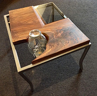
Light Table no. 66.  Sean Carleton
So very distinctive, this lovely piece arrived in
the Gallery in time for the April show opening of
Lighting Up Spring.  Note the inset lamp and complex
design, which includes walnut salvaged from right here
on Bainbridge Island, Washington.  This is always a
nice extra, in our book.

Here's a look from another angle:
http://theislandgallery.net/shop/index.php?main_page=product_info&cPath=3_116_258&products_id=2301
This is a truly fascinating piece, with its modern melding of glass,
wood and steel elements, and easy functionality.  Even with its industrial vibe and
unusual asymmetry, it still gives a nod to the saber or cabriole leg of classic
Queen Anne or Victorian stylings, as seen in their gentle lower curves.  What a
very nice touch, assuring the table's acceptance into any decor.

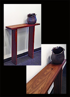
Another of Sean's pieces, offering a lovely way to
showcase a special piece of art:

Fir Console no. 47.  Sean Carleton

From above, showing off the views afforded by this
elegant console:

Fir Console no. 47.  Sean Carleton
Visit his artist's pages, under Furniture & Custom Design: Dining/Living and
Sculpture, Wood & Metal, which shows his extraordinary shelving
and lighting pieces.


Speaking of Social Media:  Whenever we Tweet a photo of one of
Chris's birdhouses, it is quickly retweeted (seems appropriate, yes?).
The little houses' current or future inhabitants must have Twitter's inside track.
Of course they do.

And apparently they like what they see here:

http://theislandgallery.net/shop/index.php?main_page=product_info&cPath=76_256&products_id=2305
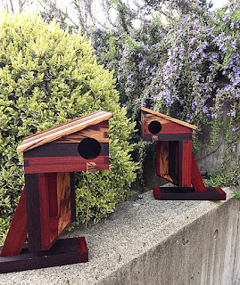
Up To Data Chick.  Chris Thompson
What self-respecting feathered friend wouldn't want to
take up residence in this?

Another view:
http://theislandgallery.net/shop/index.php?main_page=product_info&cPath=76_256&products_id=2305

Yes, yes, these two are very similar, with different
orientation of woods, which we doubt even the most
discerning woodland creature would mind.
Either one has lots of room for entertaining and growing families.
We understand these abodes pop up in excellent neighborhoods, near
food (Take-out?  Delivery?) and transportation routes, and other than squirrels,
the neighbors are usually on their best behavior.

See more of these whimsical pieces, and learn something
about Chris on his artist pages. For his birdhouses simply click here.
To view his wooden boxes, a click here is the quickest,
as-the-crow-flies, route!


Whether creating with patinated metal, soft leather, or radiant resin,
Seattle artist Erika Laureano focuses on color, texture and found objects captured in resin
in her collections of one-of-a-kind necklaces, earrings, cuffs and rings.  Below are
two of her cuffs, glowing aqua chalcedony on the left, patinated metal on the right.

http://theislandgallery.net/shop/index.php?main_page=product_info&cPath=4_255&products_id=2303http://theislandgallery.net/shop/index.php?main_page=product_info&cPath=4_255&products_id=2302

It is interesting to note that Erika's colors often seem to reflect the palette of
Dale Chihuly's glass sculptures as seen in the Chihuly Garden & Glass shop,
at the Seattle Center.


Meg Hartwell

Our newest monotype artist, Meg has her home and studio
right here on Bainbridge Island.
Geometric Jingle.  Meg Hartwell
Her vibrant monotypes, and monotype collages like this one, provide glowing
bridges of color from winter gloom to spring verve.  What could possibly
be more cheering than hanging one of these on a well-chosen wall, to
complete the seasons' transitions?  But looking beyond the bright colors,
we see something else:  Edge.  And we don't mean pointy corners.
There's a dichotomy here, speaking, perhaps, of two sides of life,
or two camera angles of the same subject, cheerfully set one on top of the
other in an effort to meld the two.

This piece is particularly pleasing, and rife with hints of something more.  Unseen.
But it certainly isn't alone.
The colors and forms used in the piece below, for example, are a blend of
wild, glorious - yet somehow subtle - sophistication.  Possibly a hint of a dark side.
Crossed with your favorite lollipops.

Pink Purple Planes.  Meg Hartwell
  Such great color, rooted in deceptively simple zones, but...floating, somehow.
Megaliths, monoliths, floating.  And grounded at the same time.  Entrancing.

And another:
Memory.  Meg Hartwell
This is also a monotype, with salt used as a resist.  It seems to
twinkle, from the depths of amorphous (but streaked) cloud in deep
earth tones that are...otherworldly?

We may have mixed up all sorts of analogies in trying
to describe Meg's work.  We make no apologies.
But we challenge you to look away.

Visit Meg here for more information on her work and philosophies.


Porcelain Vase, Wide.  Sarah Kaye
Porcelain, delicate to the eye but sturdy for the ages, is persuaded into
surprising shapes via Sarah's well-practiced techniques.  This vase,
for example, was cast in a zip-lock bag!
A closer look:

Porcelain Vase, Wide; Detail.  Sarah Kaye
The gentle "wrinkles" are most pleasing, aren't they?

Based in Seattle, this artist sparks the imagination with
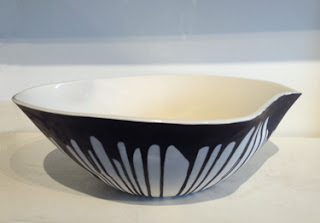
her deceptively simple - and obviously elegant - slip cast forms.
http://theislandgallery.net/shop/index.php?main_page=product_info&cPath=132_253&products_id=2308
Large Bowl.  Sarah Kaye
To add another level of visuals to this Newsletter, our
intrepid Staff journeyed across Puget Sound to Georgetown, a
newly artsy enclave in the south end of Seattle.  Long an old,
blue-collar neighborhood languishing quietly on the banks of the
Duwamish River, Georgetown has recently attracted a crowd
of up-and-coming artists, fleeing the pricey and arguably stuffy confines
of Downtown.  Having discovered the warehouse-studio spaces
snuggled adjacent to galleries, trendy restaurants and microbreweries,
they are finding them greatly to their liking.
Sarah Kaye is among these bold artists.

Sarah in her studio
Sarah uses porcelain, its utter whiteness a perfect foil to
dark contrasting colors.  The designs are simple, or at least
deceptively so; but whether complex or familiar, her goal is to
have you hold them in your hands.

Which sounds like a really good idea:
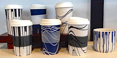

(We would like three or four... no, all of these, please...)

Scenes from Sarah's studio:

Her sparkling electric kiln...
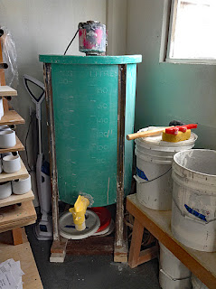
A tall vat - or blunger - for mixing liquid porcelain, before it is
poured into molds, a process known as slip casting.


The resulting treasures.

To see more of the treasures coming out of Sarah's studio, and to read about
her life and art, visit her here.


SOCIAL MEDIA

As we mentioned at the top of the post, we've been dipping our toes into social media lately.
The possibilities are intriguing, and endless.  We'll talk more about this in a separate post,
but for now, you'll be seeing these must-click icons in our correspondence, our brand-new
mailers, here on the blog, and on our main web site.

 http://www.theislandgallery-artblog.blogspot.com
Our Blog


http://www.facebook.com/The-Island-Gallery-114673935258715/

 Facebook


 http://www.twitter.com/islandgalleryBI

Twitter

https://www.instagram.com/theislandgallery/

 Instagram

http://www.pinterest.com/sswannacknunn

Pinterest

http://www.theislandgallery.net/shop/

Our Extensive Online Shop!


With that, please feel free to click away and explore The Island Gallery!

We hope you've enjoyed this quick look at our spring arrivals; please visit us again soon.
In the meantime, to subscribe to our Newsletter and monthly show mailer, and receive
notices of all upcoming sales and events, click on the About Us/Profile box at
the left of this page, go to "Contact", click on "Email", and send us a note.
We'll sign you up right away.

Sunday, July 3, 2016

July 2016 Gallery Picks Newsletter

We are poised once again on the eve of summer's Main Event, the Fourth of July.  And if you're rushing around, preparing for the inevitable barbecues, parades and fireworks, perhaps we can offer something extra:  How about a little Independence Day art-viewing on a long, leisurely holiday weekend?  And if you have friends and family in town, we would invite you to bring them downtown for the festivities - and stay for the art!

On the other hand, if you can't tear yourself away from all that grilling and those sparkling fireworks, no problem there either:  stay right  here and scroll through our beautiful offerings at your leisure, then simply click on the photos for a magical visit to our Online Shop.

And on the third hand (we don't know about you but we would really love to have a third hand during these busy times...) we have a new feature, with a delicious suggestion for those wonderful meals you're planning.

Enjoy!

STUDIO FURNITURE

Indoor/Outdoor Maple and Walnut Bench
Here's a lovely summer sight:  A flower-strewn patio, a beautiful
day, and a bench to sit on to enjoy it all.

This lovely indoor/outdoor bench is crafted here in the Northwest
from a board of rich, glowing maple.  The artist has cleverly inlaid
strips of contrasting walnut, added clean-look walnut legs, and finished it
with water-resistant teak oil, which is often used on boats'
brightwork and decks to protect them from the elements.

This beautiful bench measures out at approximately 44" long x 11" wide x 21.5 tall.

http://theislandgallery.net/shop/index.php?main_page=product_info&cPath=3_118&products_id=1926
Indoor/Outdoor Maple and Walnut Bench, Table Top Detail

Here's a little closer look at the grain, and the artist's wonderful
attention to detail on the inlays.

Also visible in this shot is the design of the legs, which extend slightly
 beyond the perimeter of the seat, and add to the clean look we were talking about.

A gentle breeze, a splash of sunlight, book, a latte or lemonade...

Aaaaaaahhhhhhh...........

Console 3610.  Carl Yurdin

We were saying something above about clean lines, and must conclude
that this is the furniture phrase of the day!  This piece from local
wood artisan Carl Yurdin quite perfectly fits into the same category.

An oh-so-useful Hall Console Table in walnut, showing off gorgeous, deep
color and stunning grain, this is a deceptively simple piece that
is perfect for displaying art pieces, such as a small sculpture or a
painting on a display stand - even a draped textile, ornate box, or a 
perfect piece of pottery (which is exactly what we did here,
with an excellent dark-glazed vase and bright orange roses,
appearing a bit later in the blog).

Here are a few longer looks at this excellent table:
Console 360.  Detail

Noteworthy, of course, is the glorious swirling walnut grain.

More of his work can be found by clicking here.

A few words of interest about Carl:

The Island Gallery welcomes Carl Yurdin, a new artist from the industrial
design world of the East Coast, who settled first on Orcas Island and now
here on Bainbridge.

In Carl’s own words:

As an industrial designer for over fifty years, I have spent my whole career designing
products that expand the visual possibilities.  Over those years, I have remained
committed to high design standards, balancing functionality, user requirements,
regulatory needs and overall aesthetics – for both highly consumer focused products,
as well as more industrial products, like medical and construction equipment.
In my view, everything deserves the opportunity to be well designed to enhance
the overall user experience.  That perspective informs how I work today, 
having moved to the Northwest and Bainbridge Island.

My process is about investing in the beauty of the wood and revealing what
possibilities exist.  I don’t always know what will come out of a project when
I start, but I respect the materials I am working with – letting them provide direction,
along with the tools I use.  Together, we figure it out.  I strive to create pieces
that convey the possibility of nature, but bring a practical usability to bear.
Nothing is too fragile and everything has a purpose, be it highlighting an aspect
of the natural wood or incorporating it into a function of use.  That’s where the
keen balance of the industrial designer in me shines.

Walnut Slab, "Mysteria"

Speaking of glorious swirling walnut grain, it would be difficult to
find any more interesting than this...

Named "Mysteria" by the artist, we wonder if he is referring to the
 apparently random, yet definitely connected grain visible in this bookmatched slab.
The lines are a bit of a mystery!
We can see them relating to one another, yet there is
something free-form that catches the eye and lets it journey
across the length and breadth of the board in abstract fashion.

Fully finished with a tough conversion varnish, this slab begs to become a
spectacular table to be the focus of a dining room or board room, or even
as a desk for your beautiful office.

Imagine that!

We can work with you and one of our superb local wood artisans to design the
perfect legs and table top size size for your needs, and before you know it a
magnificent piece of wood will be a beloved fixture in your home.

If the rich, chocolatey depth of walnut isn't for you, though, never fear!
We also carry other beautiful slabs in various woods, like maple
and ever-popular cherry.  If we don't have what you need,
we will find it - in the right size and color to fit your decor to a T.

More slabs and dining tables can be viewed here.

SCULPTURE

Savvy Cantilevered Bird House.  Chris Thompson

How delightful is this very special birdhouse?

 Perched on a dainty (yet sturdy) bough of purple heart,
any bird with discerning tastes would be positively chirpy to call
this happy abode home!  A visual feast of style, angles and
colorful exotic woods, artist Chris is inspired by California
Modernist architecture - and dare we say, there's more than
a hint here of Frank Lloyd Wright, adding to the delight of our
feathered friends - combined with his own whimsical sensibilities.

His blending of woods is also noteworty:  the base is hard maple burl;
the support beams are purple heart; the house, African paduk;
and the roof, Australian lacewood.  The entire piece is
finished with teak oil to keep it safe in the elements.

And if this design isn't what your local birdies have in mind for
their dream house, perhaps they might prefer this one:

Savvy Bird House.  Chris Thompson
It almost looks like it arrived directly from Planet Tatooine, doesn't it?
(And will doubtless appeal to your favorite avian Star Wars aficianado!)

This one is crafted from black cherry, black walnut, bird's eye maple,
and oak, and is also finished with durable teak oil.

Both are extraordinary designs, beautifully made, fun, and altogether
perfect for gifts or as a treat for yourself - and of course,
for those wonderful non-internet twittering friends of ours.

More of Chris Thompson's pleasing designs for the home can be found
in the Baskets, Bowls & Boxes section of the Online Shop,
or click right here to visit Chris's page in a flash.

TEXTILES

"Come Sail Away" Pillow.  Tom Johnson
We were speaking above, obliquely, about boats and brightwork
and decks and such, which could most certainly fall into the
category of Summer Delights.  We live on an island in Puget Sound,
Washington State, and boating is never far from anyone's mind -
we travel by boat and ferry to the mainland, we live and party on
boats, we love our kayaks, and can't resist the sparkling diamonds
of sunlight dancing on the water that surrounds us.

So things that are boat-oriented always ring bells and raise eyebrows
around these parts.

Like this fabulous pillow, for example.

Featured in the Gallery's current exhibition, Dialogues in Fiber, the
"Come Sail Away" pillow and its companions are made of handcrafted multi-layered
textiles and each makes its own statement.

Here's a look at three others:

Pillows, left to right:  "Make No Wake", "Better Together", "F* Cancer"

Whether used as an eye-catching accessory on that wonderful
boat, or for landlubbers simply gracing a couch or bed in your
very terra-firma-attached home, these have attitude, convey
universal messages, and are stunning works of art.

Here's a little about Tom, in his own words:

This body of my work - which is created by taking multiple layers of fabric,
manipulating, sewing, cutting, and washing them to make the fibers “bloom” -
had a serendipitous  beginning.  I had fabric remnants from a variety
of architectural and interior design projects.  I started experimenting with
layering, sewing them in lines at close intervals, cutting and washing,
in an effort to create a soft, tactile, dog-friendly throw for our sofa.
The results got my creative juices flowing.  I quickly saw lots of
possibilities, determined which fabrics worked best and how this
newly created “Ridge and Furrow Chenille” could be used.  Benches
and ottomans soon followed.  “Ridge and Furrow” designs for the
wall, as well as a “quilt,” developed simultaneously.


After seeing quilts at the Modern Quilt Show in Austin that had graphic
messages, and wanting to commemorate the death of a couple of close
friends, I started creating pillows with a message. The pillows led me
to explore color applied in strips to the top layer.  My most recent
piece, “Passage,” utilizes this technique as well as washed
and unwashed layers. 

The process continues to excite me and take me in new directions.  I am
influenced by the tradition of quilt making as well as by modern and
minimalist quilts (and on some level by the randomness of Jackson Pollock).
I’m inspired by the surprises that come from the layers beneath the surface,
the interplay of color, interpreting what I see around me in this
medium of fabric and threads, expressing a message that grabs me,
and the endless possibilities.
   
These pillows can be viewed on Tom's pages in the Online Shop, along with
more of his quite diverse art pieces - wall art, ottomans, framed
pieces - right here.

WEARABLE ART - JEWELRY

Earrings Tahiti, White.  Begona Rentero
We surely have said all there is to say when it comes to
Begona Rentero's truly, TRULY spectacular jewelry; and
yet here we go again!

Ladies:  Is there one single thing in the world of clothing/accessories
that says "SUMMER" more immediately than a fabulous pair of earrings?

We think not.

And is there a more fabulous pair of lightweight, flora, fauna, and specialty
earrings, in special editions, presented in handmade boxes, each made especially
for each style, whose designer has been honored in a New York museum as one
of the 50 greatest up-and-coming jewelry designers anywhere on the planet,
than a little something from the studio of Spanish artist Begona Rentero?

Most unlikely.

And is there another design than the glorious blossoms in white Tahiti
shown above that we'd rather be wearing in our deckchair,
or in the prow of that boat, gliding over the sun-diamonds,
or running around town, or for the fanciest of fancy late-evening parties;
or at the theatre, or the opera, at the Fourth of July parade, or on a really hot date?

Hmmm??

Well... maybe this...

Earrings Kenai, White.  Begona Rentero
What is a lady to do?

Buy both?  Why not?

Oh, but then there are so many more to choose from...

Okay, we admit it, we may have a slight problem, because we
really do want them ALL.

Like these.

(Oh, yes, and you can click right here to see more earrings.)

And don't get us started on her necklaces.
Or bracelets.
Or brooches.

Somebody please stop us...


Here's a little about Begona:

Spanish designer Begoña Rentero, originally from Granada, grew up
in a family that had a profound respect for nature and the environment.
These early influences developed into a passion for organic forms,
color and movement inspired by nature. Begoña later translated this
passion into a jewelry collection featuring a series of unique pieces.
The colors and organic shapes of winter flowers, flora and sea
fauna have inspired her latest collection of hand-made, exquisitely
crafted jewelry. The pieces are made of special paper, fibers of silk,
cotton, et cetera, that she prepares with a method she has developed
to toughen them up for daily use, without compromising their delicate,
organic aesthetic. Using only natural dyes her pieces both reflect and
respect the environment and, as she says, "are so light you have
to touch them to know that you're wearing them."

These beautiful jewelry items are made entirely by hand, in Spain.

Strands, COLL 08.  NEO
And then of course, there's this!

These looooong strands of vivid, gemmy neoprene, embellished
with silver bullons, are addictive!  Here's how long they are:

Strands, COLL 08.  NEO
And how oh so versatile!  Buy your favorite colors, then loop, coil
or twist them, doubled, maybe tripled, or leave some
long, and have fun with them.

We have semi-joked in the past that you can easily wear Neo's
neoprene creations scuba diving, if you so chose, as
they are made from the self-same material of scuba suits, but
it's actually true.  The metal highlights are little hex-nut-looking
silver bullons so would be uninclined to rust.  Therefore - and
we seem to be talking about boating quite a bit today - if you simply must
take a dip off the family yacht or dinghy or other wondrous watercraft, you're all set!

Actually, now that we think about it, these would be great for the beach,
with a cute bathing suit and silky cover-up... how about that!
And as they hail from Italy, I think the ladies of NEO
may have intended this use all along...  So please, put on that bathing suit
and fearlessly drape yourself in these fabulous waterproof strands for an
unbeatable summer look.

WEARABLE ART - CLOTHING

Modified Issey Jacket, "Masai".  Front.  Kay Chapman
Crisp, cool, relaxed, stylish.

This piece says summer for Kay Chapman.

Button to wear as a shirt or leave open as a jacket to get
so much use out of this single versatile piece of clothing.

Kay's designs tend to reflect nature and modern ethnic-themed
inspirations, as seen in the African tribal Masai appelation
and also in many of her other styles. 

A look at the divine back and collar detail:

Modified Issey Jacket, "Masai".  Front.  Kay Chapman
This lovely piece (which would look great on that boat...)
is 100% cotton in sky blue and white.

And not to overstate this, but let's take a look at
her spectacular color choices:

Modified Issey Jacket, "Retro".  Front.  Kay Chapman
This beauty is created from dupioni silk in her style "Retro",
modified leaf/bamboo, perhaps, with a distinct abstract/urban sensibility,
in gorgeous wine and black.  It is a purplish color with an
orange or salmon undertone that is quite breathtaking.


A little about Kay:

Kay Chapman is an American fabric artist/clothing designer who shows
her work in galleries and boutiques nationwide. She works primarily
on natural fabrics: silk, linen, cotton and wool, as well as bamboo. Pattern
and color are applied to the fabric using direct dye techniques, usually
stretched over bars and painted with either fiber reactive or acid dyes
using foam brushes. Dyes are then set by steaming. The fabric is washed
and rinsed and ready to be made into the garment.

Kay's goal is to create styles which flatter a woman’s body and are easy to wear.

Ponchette, Rust.  Bobbie Sumberg.  Multicolor Necklace, COLL 22L.  NEO
So if night is approaching and the boat is getting a little cool
(and you can easily substitute "barbecue", "pool party", "wedding",
"theatre", or "romantic outdoor dinner" for "boat")
just toss this beautiful ponchette over your shoulders and get cozy.

This fine knitted "Ponchette" is created from softest wool and is
available in a variety of subtle colors and two different lengths, with perky tassels.
They are one size and certified no nonsense - no flapping off in a
stiff breeze, no fiddling and unsuccessfully knotting it when dancing,
no chilly shoulders.  Just cozy convenience, and the
extraordinary softness that is so delightful when wool and
silk are combined in a fine knit.

See more color choices here.

We must also point out that our mannequin display includes another
superlative NEO piece, this one a multi-strand necklace
in many colors, again made of neoprene, ultra-lightweight,
and it looks super with the ponchettes.

(Or the bathing suit... remember the bathing suit...)

Here's a slightly closer look at it:

Multicolored Multistrand Necklace.  Neo
Goodness:  Too much fun!

CERAMICS

Tea Bowl, Turquoise Glaze.  Joe O'Brien
Bainbridge Island ceramic artist Joe O'Brien has brought us
a series of tea bowls that he has wood-fired right here on
our beautiful island.  A retired art teacher, he loves
experimenting with glazes in wood fire, and is getting
some great effects with them; he is said to be one of few wood fire potters
to be successful with the glorious turquoise hues that can come from
the copper component of the glazes.

Here are a few other examples of his tea bowls:
Winter tea bowl, shino glaze.
Turquoise glaze, celadon toned interior.
Journey along this link to see more of Joe's very interesting work.

Here's a little something about the artist:


Ceramic artist Joe O’Brien of Bainbridge Island was educated at the
University of Washington (BA, Art Education) and in ceramics at Northern
Illinois University (MA, MFA).  He has exhibited throughout the
Midwest as well as the Northwest and operated a custom ceramic
tile business for many years.  He collaborated with Jacob Lawrence in
the designing and creation of a ceramic mosaic mural for the City of
New York and designed a porcelain enamel mural for the Orlando
International Airport.  More recently he has proposed a ceramic mosaic
mural for the Washington State Capitol.

"Open", Vase.  Lisa Wederquist
This appealing earthenware vase is graceful, with its
unabashedly abstract inclinations, bold in coloration, and
looks terrific hosting a big, bright bouquet of flowers!

Just imagine how this piece could be used
(you've seen it before above, but it's so pretty, let's indulge ourselves):


Here's a bit about Lisa, who has been with us as a painter for
several years, and who is now adding ceramics to her
growing list of talents:

Born in Germany, I grew up in Colorado Springs, Colorado. As a child
I roamed the then wide-open foothills and canyons of the front range
of the Rocky Mountains. This connection with nature has always
sustained and inspired me.

I studied painting and industrial design at Colorado College, City
College of San Francisco, and Pratt Institute.
Living in San Francisco for five years, and New York City for ten,
infused me with the wonder, freedom, and crazy richness of urban life.
I returned to the West, moving to Santa Fe, my home since 1991.

I have been a painting contractor and decorative painter for many years.
I have always been an artist. The scale of many of my paintings is
informed by a love of physical work, the imagery by
a love for the physical world.

VISUAL ART


Another series from Bainbridge Island's own Irene Yesley,
an artist who pleases with her seemingly endless artistic experiments,
as she continues to push the boundaries of her art form.

These two amazing examples, which certainly bring to
mind vast solar systems and galaxies, are both Monotypes on two layers
of plexiglas, showcasing Irene's remarkable layering techniques.

We must point out that because of this stunning layering,
it is very difficult to fully capture in photographs the full impact of pieces created
in this style, to show their true depth that is only perfectly visible when viewed in real life.
If you're already a fan of Irene's work, or perhaps more importantly,
if you've never seen her work before, please visit the Gallery
for an up-close, in-person look.  They must be seen to be fully appreciated.


Outer Space with Gold.  Irene Yesley
Here's Irene's information:

Irene Yesley of Bainbridge Island, Washington,describes herself as a
geometric abstract minimalist, designing hard-edge patterns
against a relatively flat background. Physical textures, such as brush strokes,
play a minimal role to the interplay of positive and negative shapes,
and the emotional impact of color.

Irene describes her journey:

I earned an MFA in printmaking from Arizona State University.
After graduation, I bought two floor looms and started making rugs
and tapestries. Eventually I grew frustrated with the restraints of weaving,
the warp and the weft, and especially the fact that I could never change
anything, so I sold my looms and started down the path of rediscovering
what kind of artist I wanted to be. I attended Haystack School of Art
 and Crafts in Maine, where I was fortunate enough to have Warren
Seelig as my instructor. He opened the door to all sorts of
materials and experimentation.

Since then I have used pencil, pastel and oil stick on paper, done
reverse painting on Plexiglas, acrylics on wooden panels and gesso
board and now I have returned to painting on layers of Plexiglas
and stacking them to make 3 dimensional paintings.

The outdoors is the biggest influence on my work. The first landscape
I knew was Spokane, Washington, where I grew up. That was followed
by the cactus of Arizona for 5 years, the urbanscapes of Boston and
Washington, DC, the chaparral of Topanga Canyon, and 22 years
in the desert of Santa Fe, New Mexico.  For six years until 2004, we
had a condo in Kas, Turkey, on the Turquoise Coast of the
Mediterranean, where I spent six months a year

Now I live on an island across the sound from Seattle in a temperate
rainforest. Without even being aware of what was happening,
each new location has changed the shapes and colors in my work.

A piece of Irene's will be featured in the upcoming 2016 August
All Gallery Artist show, and in another show in 2017 (date to be announced).

Golden Orbs.  Single Panel.  Karen Chaussabel
Making her home on Bainbridge Island as well, Karen Chaussabel describes herself
as "a mixed media artist in the making."  We are happy to be able to say
that she is also currently an Associate at the Gallery, and one of
our intrepid photographers, without whom this blog would
most likely be made up entirely of very boring words!

Karen originally hails from France, and infuses her work with the
nature and countryside of her youth, allowing her life
experiences to impact her work - as all artists do - but conversely also
allowing her art to impact all areas of her life
(which all artists don't!).

This special sensitivity not only produces very meaningful art, but
inevitably creates surprises along the way.
(Keep reading; we'll introduce our own Karen-oriented SURPRISE in a moment.)


The work shown here, currently available at the Gallery,
is primarily encaustic, pen and pencil with mixed media.
First, though, we'll let Karen discuss encaustic in her own words:

Encaustic paint is made of  beeswax combined with resin and color,
in either paint or pigment forms. It is used heated and applied to a
variety of surfaces. My favorite surface for encaustic is paper.  I make
monotypes and also brush [or] draw directly on the paper.

When making encaustic monotypes, I brush warm encaustic on a hot
plate, or melt encaustic directly on the hot plate, then I lay a piece
of paper over the encaustic and pull it up.  I like the next step,
the reveal, where I look at what happened on the paper. Colors blended,
spread, an image was created from this fluid interaction. The exciting
part for me is discovering this newborn image and looking at it,
being with the fullness of possibility.  I can let it be enough, or
I can keep on exploring with it, adding lines with pencils when it is still
warm, layering another color, blending them further by rubbing.  It is a
medium that allows me to practice being open to possibility.

Harvest of the Heart:  Fullness III.  Karen Chaussabel

Karen continues, with thoughts about her work:

I work on paper, creating encaustic monotype, using inks, pencil, fiber
for mixed media, and also enjoy the feel of clay. I am an explorer by
nature and will try different techniques and materials, just to see.
I am very much driven by curiosity.  And in the process I find
more than one way to express my creative voice. Just like a tree
going through the seasons or standing in the light at different times
of the day, my voice takes on the tone of its place in time and space.

Karen presents a series of fruit- and vegetable-like
forms, suggestions of the harvest, the heart's attachment to it,
light, and summer.

Oh, and speaking of fruit and vegetables...

Introducing A New Feature:

An Artist's Approach
Food As Art
 
(or, Art As Food, as you will...)

There's just no getting around it, sometimes life imitates art.
And when one is an artist, glorious overlapping and
wonderful surprises inevitably occur!  As we feature this month the work of an artist
 who has an abiding love for nature and its bounty - and who also happens
to be a great cook - her inspiration is sure to whet your appetite for more!

Encaustic and multi-media artist Karen Chaussabel takes us
to the French countryside, sharing with us her love of cooking
 in the tradition of her homeland.  This first offering is a beautiful suggestion for a
summer evening's dessert, filled with freshness, taste, and heart.


Karen Chaussabel
For me the kitchen is just another studio! I let the ingredients
guide my choice of what to prepare.  Growing up in the countryside
in France gave me ample opportunities to taste what grew in my family's gardens,
in the fields (blackberries) and forests (mushrooms, blueberries, chestnuts)
and farmers markets, and a sense of gathering around food from our
often lengthy family dinners. As a teen I worked
at a Farm to Table restaurant, which added layers of kitchen tips, flavors -
all of which would come into focus once I left France for the US,
and was handy know-how for working in catering through college.
All those flavors, those experiences, they all came with me! 
Since moving to Bainbridge Island I have been able to reconnect to
my country roots, to the joy and enthusiasm of preparing, and
eating, what is in season, and locally sourced
The question of what's for dinner is one I approach like I paint,
I don't know until I start!!!
I look at what I have, what I found at the garden, from my CSA with
Leapfrog Farm or other finds from the store or farmers market - and I 
go on from there!

I think being a visual artist does influence how I cook.
I choose vegetable combinations with an eye for color. I do believe
we eat with our eyes first! Next layering flavors with herbs, spices,
texture is a way for me to create dimension in the meals I make. 
 A pan, a plate, are my other canvases.


I feel clafoutis, shown below, is the ultimate versatile canvas: growing up with a
small cherry orchard in our front yard, there were many traditional
classic cherry clafoutis but I also like apricot/raspberry when the
eastern Washington apricots comes into season (now!). For Thanksgiving/Holidays
I make a cranberry clafoutis flavored with orange. The possibilities are endless!!
I so appreciate that art has and still is teaching me that, no matter what my canvas is!

Traditionally there is kirsch or some kind of liqueur (Grand Marnier
added with oranges/cranberries is yum!)
Sometimes I add almond meal for flavor, texture; soy instead of regular
milk. Basically it’s dairy-free and gluten friendly if you want/need it to be.
And low sugar. Apricot/red or black currants is a great combo
for the sweet/tartness too.  And you can dress up with whipped cream!

Apricot-Raspberry Clafoutis
using Basic Clafoutis recipe based on Suzanne Goin
Sunday Supper at Lucques

3/4 cup all purpose flour, sifted

1/2 cup sugar
3  large eggs
1-1/2 cup whole milk or non-dairy milk 

pinch of salt
1 tsp vanilla extract  
3-4 apricots, depending on size, cut into quarters
 1 cup of raspberries or more if you want!! (black or red currants work too!)
Optional: a sprinkle of slivered almonds, pecans, almond flavor (1/2 tsp) on top; a splash of blackcurrant or raspberry currant liqueur or rum to flavor the batter

Heat up
to a gentle simmer the milk, sugar, and any spices you are using 
until sugar is dissolved.
Add vanilla, or almond extract. Take pot off the stove.
Beat the eggs and add to the milk mixture. Mix until blended.
Sift in the flour.
Let the batter rest for 20 minutes, up to one hour.

While batter cools:
 Heat the oven to 350F.
Butter a 9-inch cake pan, add apricot slices in single layer, sprinkle on the berries.

Pour the batter over the fruit.


Bake for 40-45 minutes.

NOTE: If you are short on time, you can also make this batter cold:
mix cold milk, eggs, sugar, flavorings, et cetera, then flour; pour batter on the fruit and bake.


Notes for other fruit and flavor combinations:
Flavorings options: almond extract, lemon or orange zest, liqueur,
spices, frozen berries, rhubarb (fruit can be used frozen).
Substitute 1/2 cup of almond meal for flour.
Sprinkle nuts on top of the batter for added texture and taste
Dried fruits cranberries (great with walnut or pecans), blueberries, apricots,

figs, alone or in combination with fresh fruits.

Clafoutis is best enjoyed warm, at room temperature.
Also very good next day as flavors infuse.


Well, that's the blog for now!  Please have a safe and fun 4th of July, and check back soon for more beautiful things to see in the world of art, and another recipe!  Don't forget: if you'd like to have us send you advance notice of a newly-posted blog, simply send your e-mail address to ssn [at] theislandgallery [dot] [net] and we'll put you on our mailing list.*

*We present our e-mail address this way to discourage spammers, phishers, and other internet nasties.  Thank you for  understanding!

Posted by:  S. Roth, 7/3/16